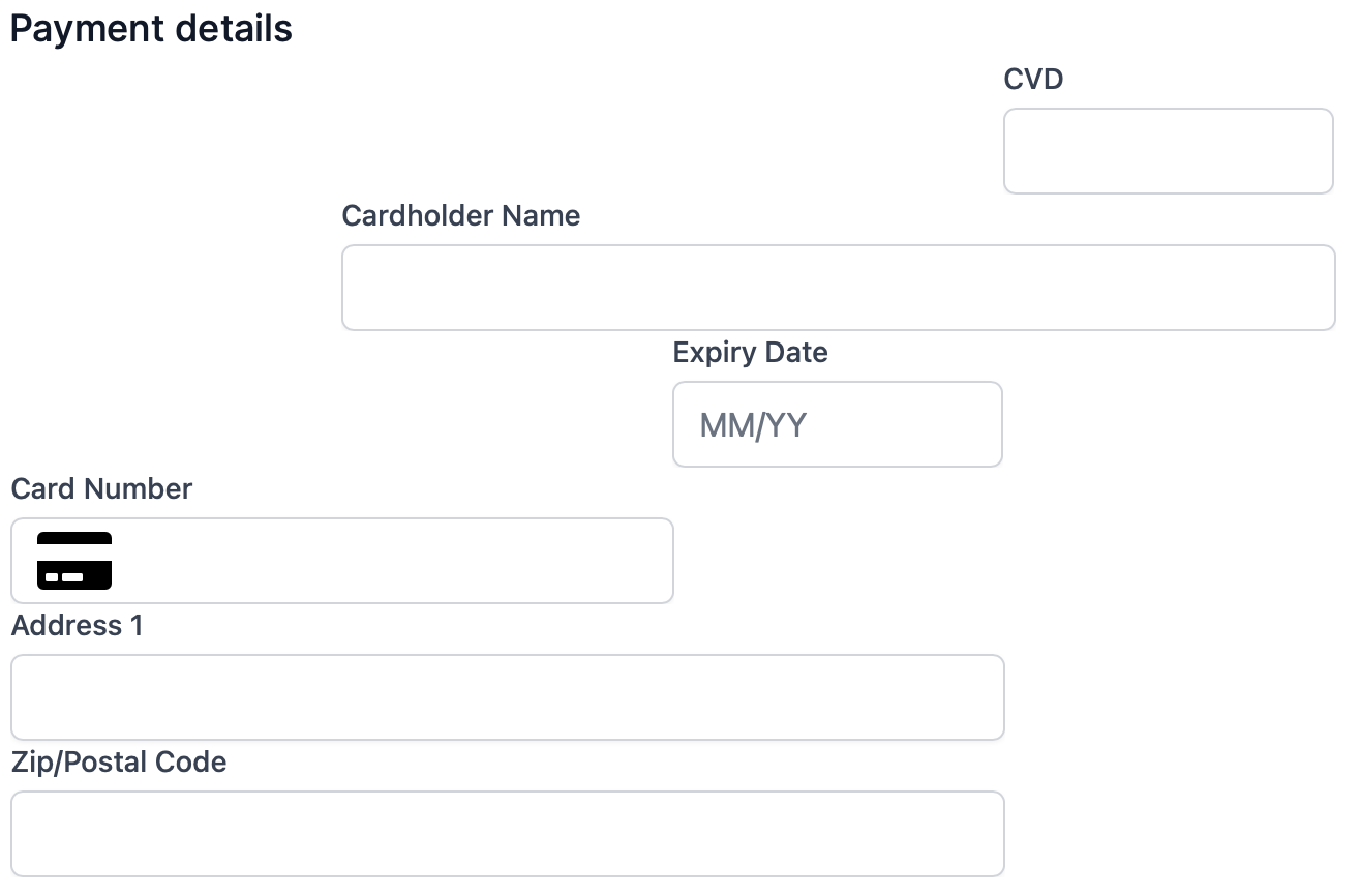
Individual Components
Payment Form with Separate Components
If you would prefer to build your own custom payment form, we also support the required form elements as individual components.
Example: https://github.com/exact-payments/next-merchant-demo/blob/main/p2-complete/pages/checkout2.tsx
Supported components are:
- Cardholder Name (optional)
- Card Number (mandatory)
- Expiry Date (mandatory)
- CVD/CVC (mandatory)
- Address (optional)
You can add these to your payment form, in whatever order, or placement you wish.
Instead of a single cardElement we will declare divs for each of the card components.
<div id="nameDiv"></div>
<div id="cardDiv" ></div>
<div id="expiryDiv"></div>
<div id="cvdDiv"></div>
<div id="addressDiv"></div>
Now we can configure the form as follows:
const components = exact.components({orderId: "the_order_id"});
components.addComponent('nameDiv', 'cardholder-name');
components.addComponent('numberDiv', 'card-number');
components.addComponent('expiryDiv', 'expiry-date');
components.addComponent('cvdDiv', 'cvd');
components.addComponent('addressDiv', 'address', {
  billingAddress: {
    type: "partial"
  }
);
Each of these <div>s is part of your page and can by laid out using your own CSS, for example, this completely whimsical grid layout!